Product Update: Percentage change on graphs, best posts and a video tour

It may seem like the world is grinding to a halt, but here at Maybe* we're busy beavering away on tech developments to make the product better, faster and smarter. 

The big news so far in May is that we've added percentage change to all graphs so you can see the change against the previous period on all number graphs and on the report builder and you can now see the best posts by engagement or reach on Facebook, Instagram or Twitter.

Also, very excitingly, we've begun our integration with LinkedIn so you can now see your audience growth history - but there is so much more to come next month.


Are you more of a watcher and less of a reader? No problem, click the video below to see the updates within the platform. 
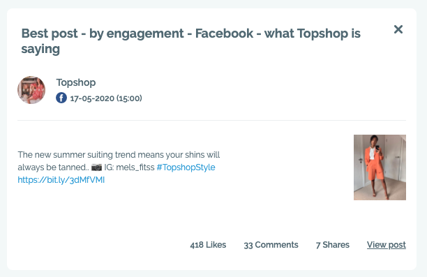
Best posts

On the Report Builder you can now see best posts by engagement or reach on Facebook, Instagram or Twitter. So, in the example above, this is Topshop’s best post on Facebook in the last week by engagement. 

% change for all number graphs

You can now see the % change on all your number graphs so you can clearly see if engagement has gone up or down.

LinkedIn Audience Growth (Beta)

You can now see your growth history for your Linkedin audience on your audience growth page. It only starts recording when you connect it so go to your social accounts page on settings and connect it now. 

In development

  • Connect to LinkedIn and see your posts.
  • New and improved comparison report.
  • Ability to edit incorrect social handles when adding a conversation.
  • More recommended conversations.
  • Ability to write notes under each graph on report builder.
  • Ability to create notes so that you can collaborate with your team on actions.

We love hearing from our users. Please let us know any feedback or suggestions for features by hitting the blue message button in the lower right corner.