Wondering whether your social media efforts are driving real results? Flummoxed by the different reporting and analytics across Facebook, Twitter and Instagram? We’re not surprised. There are a lot of metrics and reports available and it can be hard to know which bits of data to pull out each week. We’ll show you the important info you can glean from Facebook, Twitter and Instagram, such as how your posts are performing and what your audience is up to, and then show you how to make social media reporting so much simpler. Sound good? Then let’s dive in…

How to measure your social media performance
 by Amy Rountree
How to get your data from Twitter, Facebook and Instagram
Here’s how to find your data on Twitter, Facebook and Instagram, and what you can use it for:
Twitter Analytics
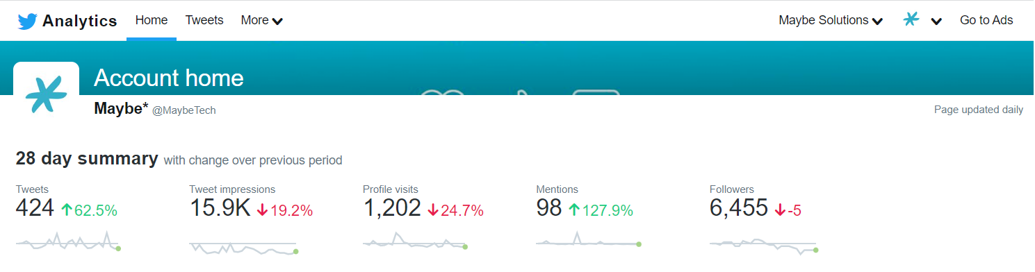
Twitter’s native (that is, in the Twitter platform itself) Analytics offering is impressive. Find it by logging into analytics.twitter.com with your Twitter username and password, and you’ll be taken to your Analytics homepage, featuring an overview of your activity. You’ll be able to see a 28 day summary of data, and how your performance measures against the previous 28 days, including number of Tweets posted, your follower count, and the number of profile visits you’ve had over those four weeks. Scrolling down, you’ll find a calendar monthly breakdown of your activity, including your top Tweet, mention and follower of the month.
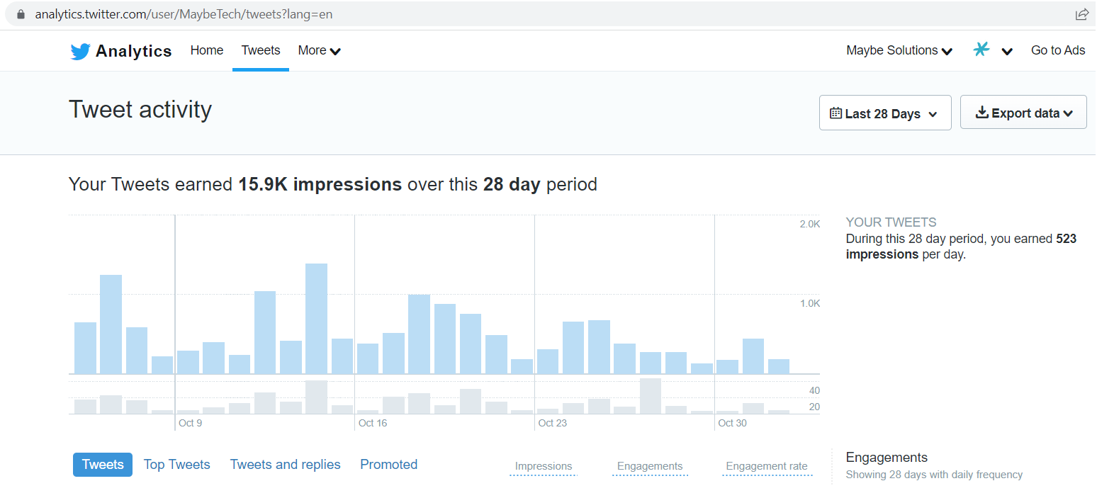
At the top of the page, click on the Tweets tab to really get into the details of your Tweets’ performance. Here you can set your own date range, or just pick a calendar month, and dive into graphs galore.
Facebook Analytics
Facebook Analytics has been rebranded as ‘Page Insights’ (as of July 2021). You can still view your Page’s data though, and here’s how to find it.
From your Feed, click Pages in the left menu.
Go to your Page.
Click Insights in the left menu.
Once you’ve accessed your Insights, you’ll see a pop-up with an overview of your Page’s performance from the past week. From there, click the button at the bottom of the pop-up to ‘View all Insights’.
From the Insights page, you’ll also be able to see a breakdown of your Instagram data, as Facebook and Instagram are both owned by the same company, Meta. Using the menu to the left of your screen, you’ll be able to get an overview of your Page’s reach, gain insights into your Facebook and Instagram followers, and in the Content tab, set a date range and scroll through a breakdown of how well your posts have performed on both platforms.
Instagram Analytics
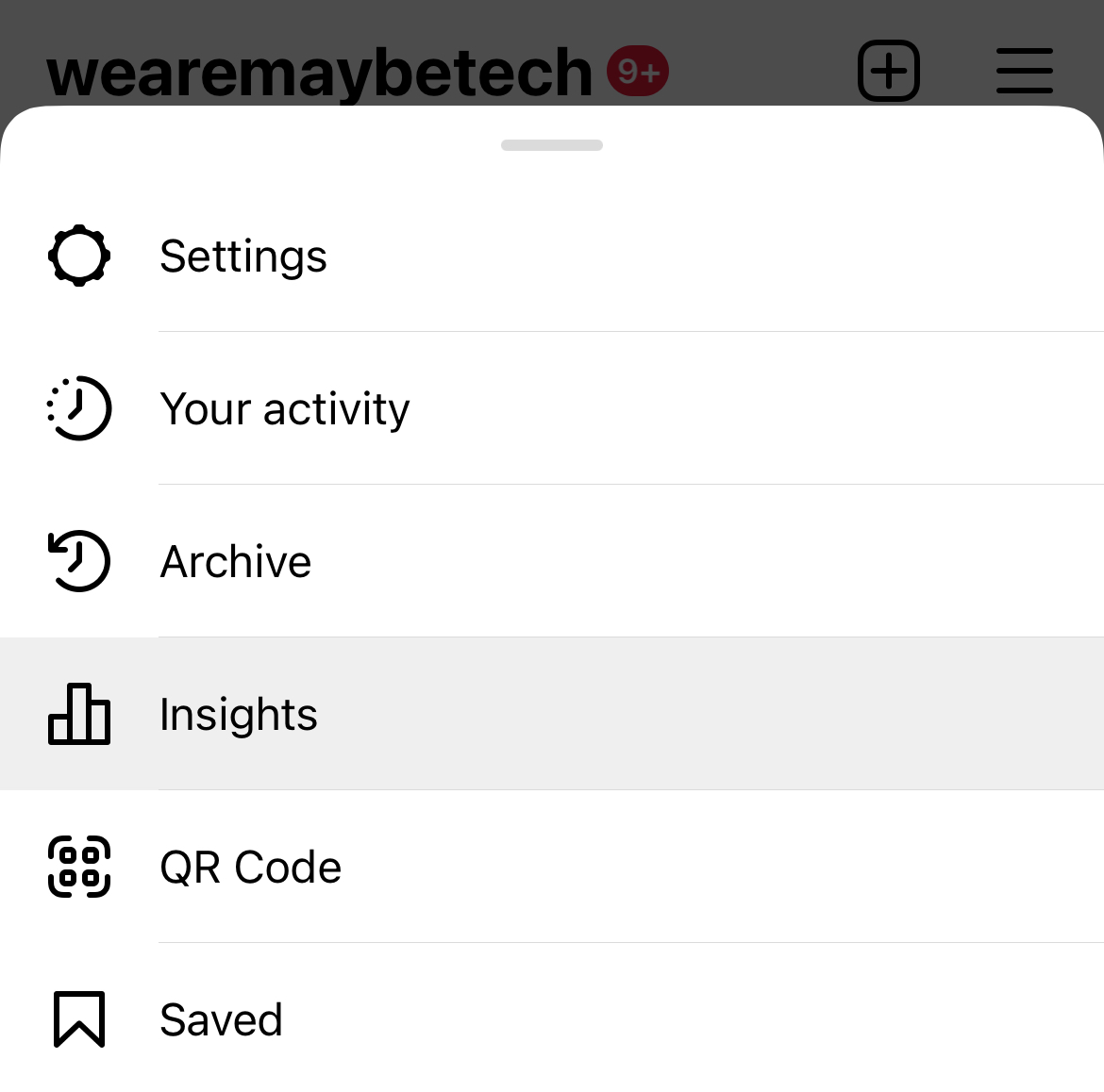
To view your Instagram data, you can either use Facebook as above, or go straight to Instagram itself, via your mobile app.
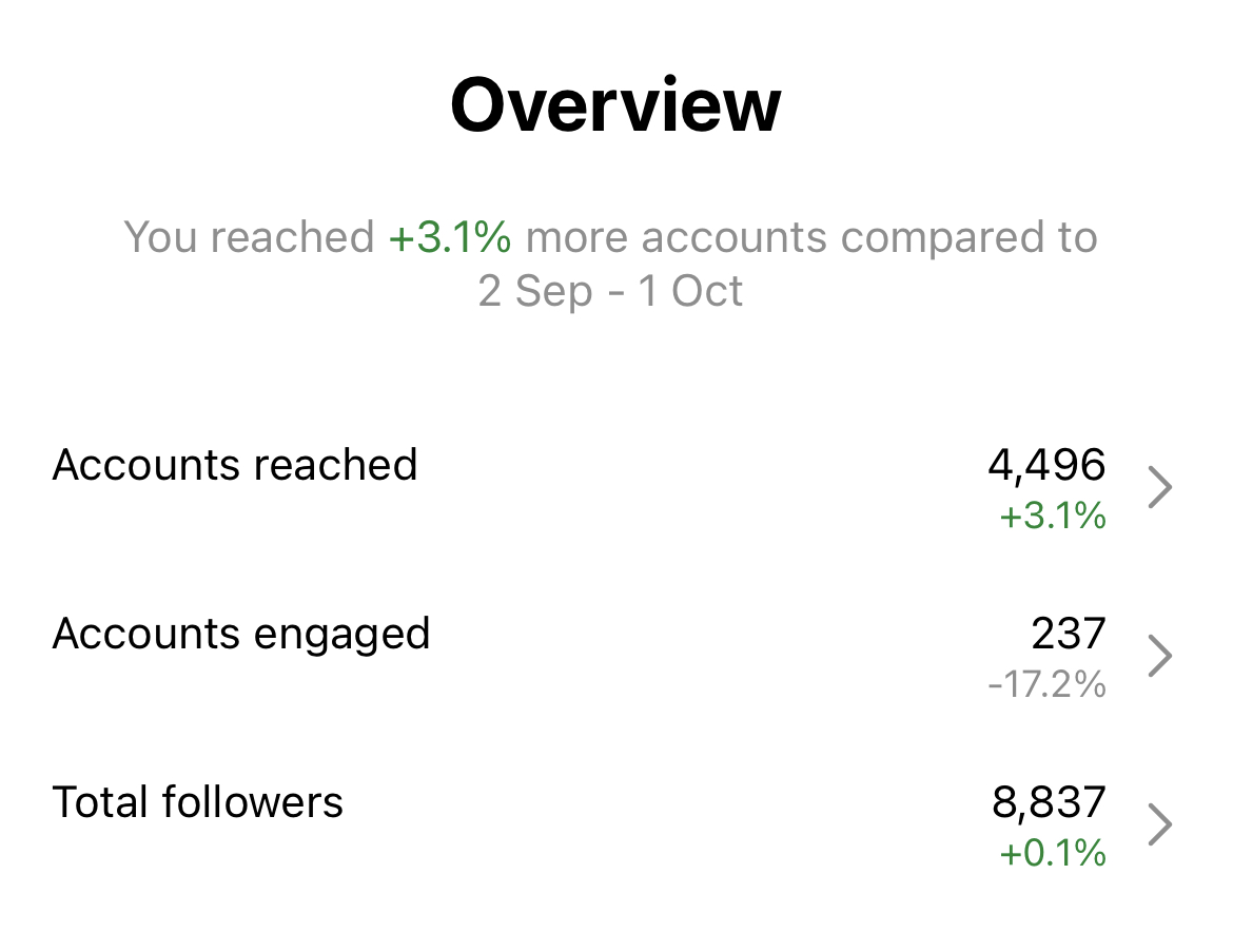
To access your account insights, go to your account’s profile page, then either tap ‘Professional dashboard’ to go straight to some insights, or click on the three horizontal lines (also known as a ‘burger menu’) on the top right of your screen. From there, click on ‘Insights’, and you’re good to go.
You’ll be able to access an account overview from a customisable date range, though the minimum is seven days.
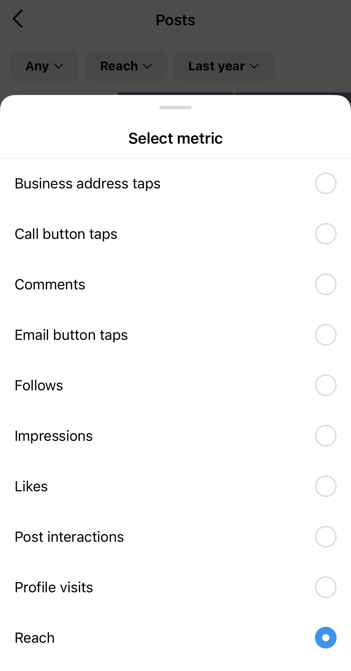
You’ll be able to sort your posts according to their reach, overall impressions, or post interactions, and Instagram will arrange your posts with the ones that have received the most engagement at the top, and tapering down to the quieter posts at the end, so that you will easily be able to see which posts are hitting the mark with your audience.
How can Maybe* help?
Maybe* saves you time by crunching the numbers so you can focus on what matters. When you sign up for a free Maybe* account, you’ll be able to use its powerful social media reporting tools to measure your social media efforts across Facebook, Twitter and Instagram all in one place. That means you don’t need to run separate reports and download multiple spreadsheets to track your social media performance.
The ‘Your Report’ feature inside Maybe* shows you your Facebook, Twitter and Instagram analytics in one easy to understand report, visually represented in graphs and charts. Note: Maybe* is used best on a desktop.
Your Report includes the growth of your following, if your content is reaching people, and if it’s working to drive engagement. Use the elements of Your Report to keep track of what is and isn't working and understand the impact your activity is having, so you know where to focus your efforts.

What is the Maybe* Report showing me and how do I use this information?
Growth history shows you the number of followers you have across Facebook, Twitter and Instagram over time. Use this to track where your social media audience is growing fastest so you know where to put your efforts.
The best post shows you the social media post that’s had the most engagement for Facebook, Twitter and Instagram. Use this to understand what content works best for you, and which social media platform works best for you.
You can also see the best posts by reach for Facebook and Instagram. (Twitter does not make this information available). You will also see the best posts created about you across Facebook, Twitter and Instagram.
Your reach report filter shows you how many people will have seen your social media posts in their feeds over the last seven days. Use this to understand what day of the week the most people see your content to prioritise your activity.
The light green shows you your organic reach (reach achieved without ads) and dark green shows you the reach you have achieved with any ad campaigns you are running.
In order to make the most of Maybe*, track your audience growth, your reach and best posts by reach you need to connect your social media accounts to Maybe*.
See what works measures engagement. Use this to learn what posts are driving engagement for you.
The first graph shows you the amount of posts you’ve made across social media, and the amount of likes, comments, shares, retweets or replies they have had. The second graph shows you the amount of conversations about you on social media and the engagement with those conversations.
The dark purple shows you posts, the lighter purple shows you engagements. If you are using paid advertising, you will also see your paid posts in dark blue, and the engagement with those paid posts in light blue. The total number of posts and engagements appears at the top of the graph, and the percentage increase or decrease in the top right of the graph shows variation on the previous period.
Click anywhere on the graph to see the posts that have driven the engagement.
The How they feel graph measures sentiment, or how positive (green), negative (red) or neutral (grey) the tone of a conversation is. Use this to understand how people feel about your social media content and your business from the comments and mentions on your posts.
You can toggle between comments and mentions. Comments will show you how positive or negative any comments on your social media posts are. Mentions will show you whether your business is talked about positively or negatively wherever you are mentioned or tagged on social media.
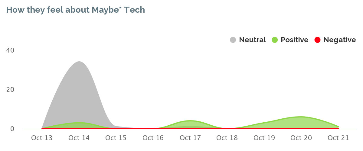
Click anywhere on the graph to see the posts that have driven the positive, negative or neutral sentiment.
Your influencer report shows you who is commenting most often on your social media content and who is mentioning you the most. The larger the bubble, the bigger the influence. Use this to understand who is engaging with you the most and who is creating conversations about you. Toggle between comments and mentions to see both sets of influencers.
Click on the bubbles to engage with all the content your influencers are posting. These folks are the most vocal and are the people making the most effort to engage with you. Whether their comments and mentions are good or bad, make sure you respond.
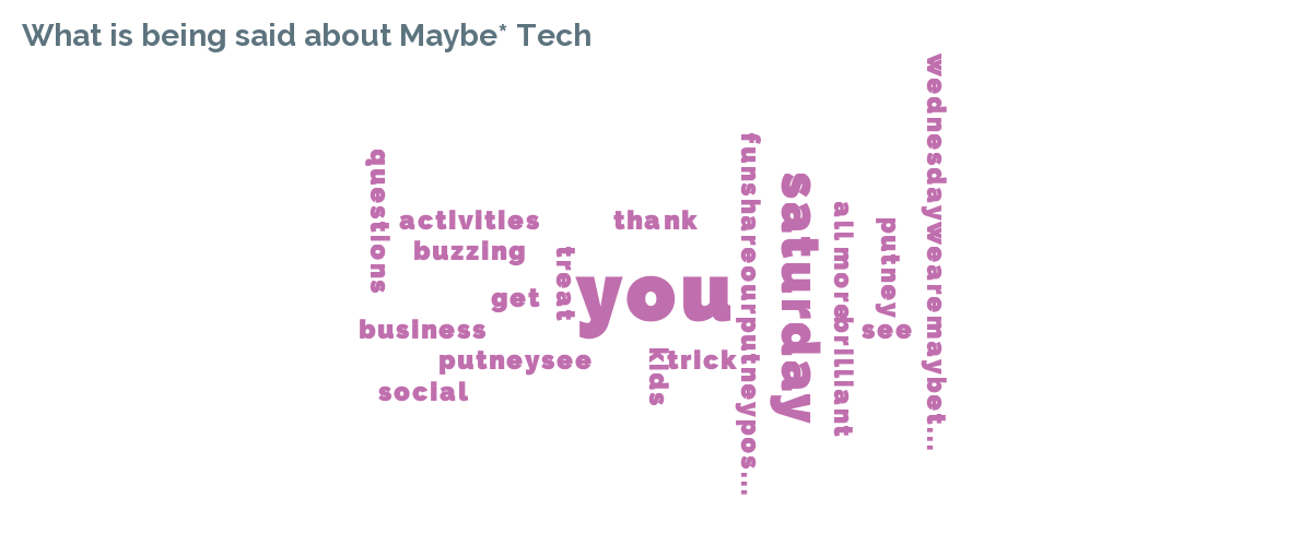
The What’s being said report shows you the words and topics you use most often. The second report shows you the words and topics used in the conversation about your business on social media. The bigger the word the more frequently it is being used. Use this to understand what is being said about you. Again you can toggle between comments and mentions.
Your Ad spend summary graph shows you how much you’ve spent on ads, and when, over the last seven days.
Need more help?
Join us at 10am on Monday for our Social Media Surgeries where we’ll show you how to use the scheduling, engagement, listening, reporting, and loyalty tools in Maybe*, so you can use them to help you deliver better business results.


Recent posts

Social media news roundup 23rd October – Instagram’s spicing up comments with polls, Facebook Pages hitting the airwaves, and more
Step right up and ride the digital carousel with us 🎠 As the wheels of the social media funfair whirl and twirl, platforms are aimin...
Don’t miss out on the ultimate guide to daily hashtags for social media success
Daily hashtags are a great source of content inspiration and a super way to increase your social media reach Daily hashtags are a ...